Authority Navy
#081A4BCredibility and structure
The Impact English visual system should feel academically rigorous, internationally relevant, and unmistakably modern without looking like a generic technology startup.
Clear space, legibility, and one consistent lockup.
Authority first, progress second, accents with purpose.
#081A4BCredibility and structure
#079447Progress and certification
#1747B8Readiness and data
#6A35D7Evidence paths and AI
#F3A51BProctoring and attention
#F7F9FCClarity and space
Editorial confidence with high digital legibility.
Clear, generous typography makes complex assessment and certification information feel credible, accessible, and easy to navigate.
Aa Bb Cc 0123456789Rounded, structured, and intentionally restrained.
READINESSPREPARATIONINTEGRITY
400question bank85%passing score5course groups
Clear label, decisive headline, concise explanation, one meaningful action.
Authentic educators, real environments, and product proof.
Experienced teachers actively facilitating CLIL learning.
Diverse adult educators in authentic institutions.
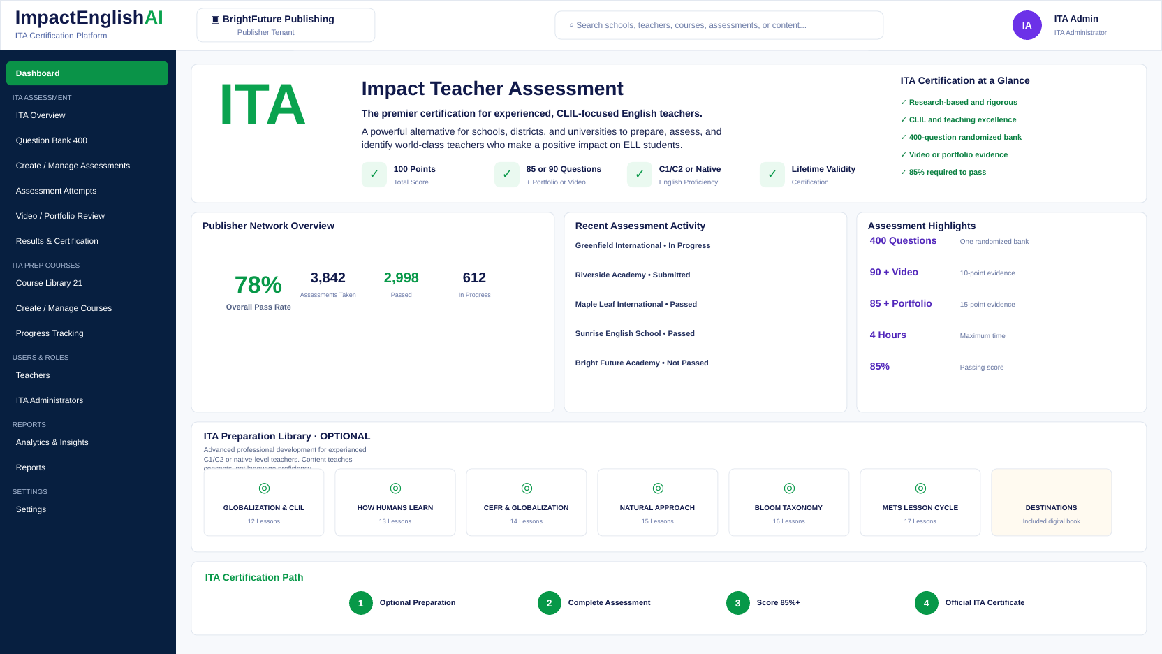 PRODUCT PROOF
Use real screens in polished editorial frames.
DO Show adult educators, teaching practice, institutional leadership, and professional environments.
AVOID Generic language-app imagery, child-heavy stock photography, flags as decoration, and futuristic AI clichés.
The design and language should reinforce each other.
Precise structure and clear qualification.
Teacher impact remains more important than technology.
International without visual stereotypes.
Modern delivery and measurable outcomes.